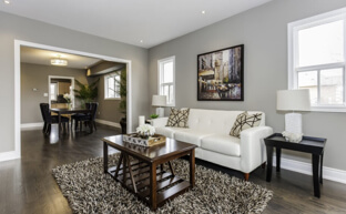
Painting the right colors in the right textures is as important to the look of a room as the lighting or floor coverings. In many cases homeowners have spent a fortune on the fixtures and decorating only to put too dark a shade on the wall or light a color the trim making the room look off-balance.
Painting is like playing the guitar. It's easy to pick out a tune and even get a whole song down but it's difficult and time-consuming to master. Painting professionals are in business because their clients either don't have the time or the patience to paint or they simply want a professional job in the quickest time.
Color is a Process
The painting process, like almost every great accomplishment, begins with an idea. It is how you think a space should look. You may see a picture in a home remodel magazine of a kitchen or living room and think, “Hey, that would look good in my home.†This where it starts.
However, before you can start sawing and ripping out the old the whole scenario must work. In other words the kitchen cabinets must match the countertops which must match the backsplash design ideas and so on. These are important components as are the appliances. And while you are deciding what works with what item the underlying shades of the area should be addressed. Because it's easier to do it at the planning stage than pour through mounds of paint samples trying to choose the one that's the least offensive!
People Are Getting Bolder
Color and shading are the basics of any design. It used to that colors on the neutral color pallettes were the safe alternative and the building industry met this desire with products that accommodated the reserved tastes in all of us. However, during the past year there has been a change in this so-called “sensible thinking†and homeowners are experimenting with colors in a way not seen since the 1960's. And this new desire to bring vibrant coloring into areas that used to be reserved for neutral tones is driving the painting industry to bring in new innovations for this growing demand.
For example, Benjamin Moore has brought out colors like Peacock Feathers and Gypsy Pink while Sico has Echinacea Flower (dark mauve) and Saxon Cobalt (blue-purple). These are a far cry from Seafoam Green and Lace Apricot of a few years back although these type of light colors are now being used on the trim.
“Green†Tones
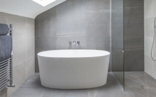
Because people are getting more conscious of the environment this has spilled over into their tastes for coloring. Tones mimicking ferns, palms and other vegetation are making their way into the pallette. The trim is a mixture of medium-browns, tans and different hues of blue which bring the outdoors, indoors, and give the homeowner a sense of nature. Mostly of these colors do best in the bathroom or areas like spa rooms and bedrooms but many people are sporting them in the main living spaces.
Every now and then black and white comes back but this time as enhancing tones for small spaces behind lighting, draperies and mirrors. Metallic finishes and high gloss finishes highlight the other hues. Reds and taupe will also cause this sensation in these areas.
Old Europe
From the walls of the Mediterranean kitchens comes a series of yellows, from drab to bright canary which are meant to go with a cluttered kitchen dècor. The sterile European design cabinets, with its banks of stainless steel, is being pushed aside for a more fun approach with cutting boards, mix-and-match for the new kitchen cabinets featuring a seprate style and color on the modules than of the wall units. This also makes room for the reds, terra cotta, marbles and other tones that go with a busy kitchen from Italy.
Textured Paint Techniques
The “faux†revolution is still big in wall covering and the textured results mimic marble and other European designs which can be put over the basic hues. Oriental designs compliments of the 2008 Summer Olympics in the Chinese capital are seeing magentas, purples, reds, turquoise blues, oranges, jade greens and deep blues. A popular texture from this part of the world is two areas of the same paint color but one painted with a regular finish and the other a bright sheen. Satiny textures or regular colors accented with satin and gold-accented drapery maintain the oriental flavors.
Whatever you desire to paint the inside of your home - you're right. The person to please is you because, unlike a few years back, it will also have a great chance to please others who come into your home. This includes resale where even the buyers are looking for dècor that's bold and exciting and real estate agents and reality shows are giving less advice on how to be conservative for a sale.
So call a painting professional and begin to express yourself.
Posted by: TrustedProsSuggested Reading For You

Painting Like a Professional; Painting Professional Tips and Techniques
Painting like a professional is possible, even for novice beginners. As long as DIY painting project ideas...
Paint or Stain the Exterior of Your Home
For the protection of the exterior of your wood-clad home there are basically two options that homeowners and ...